
The problem with “click here” and “learn more” links
3 great ways to write helpful hyperlink text when you share health content.


You’ve surely seen it.
‘Click here’ hyperlinks.
You may have used this hyperlink text in your own writing when you want to direct readers to another page or document.
If not ‘Click here’, perhaps you’ve used ‘Learn more’ or another repetitive hyperlink phrase.
I’ve been guilty of using terms like these. Have you?
Today we’ll explore why ‘Click here’ isn’t great for our readers.
Then we’ll learn better ways to write hyperlink text.
‘Click here’ text creates uncertainty for readers, slows them down, and assumes they’re clicking.
Why does it matter?
Unclear links can make it harder for a busy mum to book in a maternity health check. It makes it harder for a senior to apply for a pension. And it can also make it harder for a young person to get tax help for their first job.
Let’s explore these in more detail, shall we?
Problem 1: It slows your reader
If you’re ever writing for a website, an app, or an online tool, one of the simplest ways to see how well it works is to sit behind participants as they complete set tasks on a website.
In these sessions, I’ve discovered readers skim content rather than read every word. When they have a task to complete, they want to get it done as quickly as possible.
Can you relate?
As they browsed a website, I asked them what they were searching for.
It turns out they had keywords and key phrases in mind to help them find what they need — the same way we look up information on Google.
Headings, subheadings, and links help website visitors scan pages.
In How little do users read, usability experts Nielsen Norman Group found people read between 20–28% of words on a page.
Key takeaway: Don’t slow readers with repetitive and vague hyperlink labels.
Problem 2: It creates risk and uncertainty for readers
Imagine a salesperson knocks on your door. “I’ve got something to show you”, they say.
Would you open the door?
Hell no.
You look through the peer hole in your door and demand to know where they’re from and quickly tell you what they want.
Likewise, a generic term is risky and unwelcome. It doesn’t tell your reader what’s behind the link. They’re worried:
Will I go to a dodgy site?
Will I stay on this site?
Will I download a document I don’t want?
“Where the hell are you from and what do you want?”
If they’re not sure, they’re less likely to select the link.
That’s understandable: no one wants to be directed to dodgy sites. Waste time waiting for an unknown page to load. Or waste data downloading content they don’t want to read.
Key takeaway: ‘Click more’ makes our readers uneasy.
Problem 3: It assumes our readers are clicking
I’ve managed websites over the past 14 years and analytics consistently show more than half of all users on websites use a mobile device. Such as an iPad or mobile phone.
Yet even without analytics, you and I know how often we use our phones: to order take out, to register for events, and to research products and services.
Not every reader is clicking a mouse. Your reader is more likely to be tapping on teeny mobile screens rather than a big screen and a laptop. Or selecting options by voice.
In Don’t use “click here” as link text, W3C (World Wide Web Consortium) tells us link labels shouldn’t talk about mechanics.
Key takeaway: ‘Click more’ assumes our readers are clicking when they may not be.
So far we’ve discovered ‘click here’ creates uncertainty and risk for readers. It slows them down. And it assumes they’re clicking, when they may be using another approach.
On top of that, design research recommends we avoid ‘click here’ links.
So, how do we write better hyperlink text? Let’s explore 3 ways:
3 ways to write helpful hyperlink text
Be descriptive
Write unique text for each hyperlink
Place keywords upfront
Tip 1: Be descriptive
Clear and meaningful link descriptions help your reader quickly understand what’s on the page and where you’ll take them.
It gives them helpful information even when read out of context.
For instance, recently I’ve been studying a course at night on my phone.
After a long day working in front of my computer screen, I don’t feel like spending more time there.
Instead, I read content for each topic on my phone. Then I scan through the page for interesting links to open on another tab.
It’s fidgety having multiple screens open on a phone so I’m picky about what links I open.
I rely on clear and meaningful link descriptions to help me decide.
Especially because I’m not opening links immediately as I come across them:
I read them at the end, so I don’t remember the exact context surrounding the links.
Your readers—and you—may relate to this too.
We scan a page, figure out which sections interest us, then head off the page for more details about something mentioned on the page.
Link examples: dos and don’ts
Do add a link to:
37 words describing tone of voice
Don’t link to ‘Click here’ in:
Click here for 37 words describing tone of voice
Do add a link to:
interview with Anna Pickard
Don’t link to ‘Click here’ in:
Click here for an interview with Anna Pickard
Key takeaway: Be descriptive.
Tip 2: Write unique text
Nielsen Norman Group found that when users see the same link twice on the same page they assume it goes to the same place.
Make hyperlink text unique.
Replace repetitive, vague hyperlink text such as ‘Click here’, Read more’, and ‘Continue reading’.
An example
Recently I read an email newsletter with the link text ‘Read more’ more than 5 times:
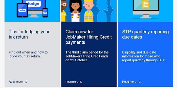
Here’s what the text in that email said (in case you have trouble loading up the image):
Tips for lodging your tax return (headline)
Find out when and how to lodge your tax return. (summary)
Read more (link text)
Claim now for JobMaker Hiring Credit payments (headline)
The third claim period for the JobMaker Hiring Credit ends on 31 October. (summary)
Read more (link text)
STP quarterly reporting due dates (headline)
Eligibility and due date information for those who report quarterly through STP. (summary)
Read more (link text)
How this could be improved
Get rid of the ‘Read more’ hyperlink
Hyperlink the headlines — they’re unique, specific, and meaningful
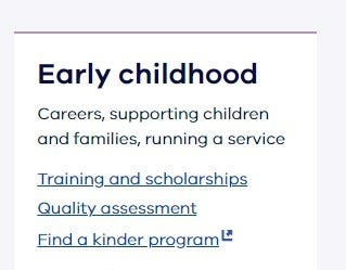
Here’s an example of a web page with clear hyperlink labels — text and screenshot included below:
Early childhood (headline)
Careers, supporting children and families, running a service (summary)
Training and scholarships (hyperlink text)
Quality assessment (hyperlink text)
Find a kinder program (hyperlink text)
Discussion
Repetitive hyperlink labels like ‘Click more’ and ‘Read more’ are common.
They don’t seem like a problem when your visitor selects a hyperlink in the context of what they’re reading.
However, your reader might want to scan all the content first then delve into the hyperlinks.
Or, your reader might be using assistive technology such as a screen reader to scan a list of hyperlinks on the page.
Imagine how unhelpful it is to get a list of hyperlinks labeled:
‘Click more’
‘Click more’
‘Click more’
This video Why Use Descriptive Links? shows how much visitors rely on hyperlink text using a screen reader.
It may give you the lightbulb moment that 99% of other writers will never get.
No matter how your visitors read your page, unique, meaningful hyperlink labels will help.
Key takeaway: Use unique hyperlink labels.
“…when users see the same link twice on the same page they assume it goes to the same place.”
Tip 3: Frontload keywords
Usability research has found users read the first 2 words in a hyperlink.
To understand why that matters, it’s good to know how people read online.
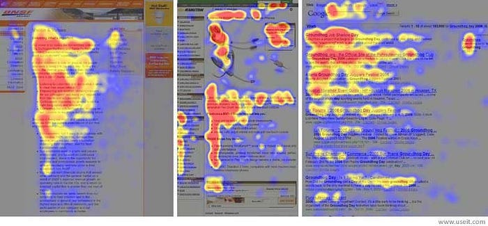
It’s been found we read mostly in an F-pattern: from left to right and down the left side of the page. We read more at the start and less as we travel down a page.
This is shown through heatmaps below of user eye tracking studies across three websites.
Red shows the areas where users looked the most. The yellow areas indicate fewer views. Blue areas were least viewed. Gray areas weren’t fixated on at all.
Place important words at the start of hyperlinks to help your reader scan for important information.
Frontloading helps with word placement in headlines too.
That’s great for your reader. Great for design when you’re limited by space. And it’s also great for your SEO.
The cost of not doing this is wasted time and effort writing content that isn’t read. Lost registrations to events. Lost sales.
Your reader misses out. You miss out.
Key takeaway: Frontload keywords.
Place important words at the start of hyperlinks to help your reader scan for important information.
Bonus hyperlink writing tips
It doesn’t matter how long or short a hyperlink is: focus on concise, descriptive hyperlinks while considering space restrictions in your design.
Use underlined blue text: an obvious visual indicator for links (note that we can’t always control the color of our hyperlinks on content management systems).
Differentiate between web page hyperlinks and documents: mention the website or media format such as PDF (these can be included in brackets or as icons and don’t have to be linked), for instance, 25 Power words (PDF, 52KB).
Don’t hyperlink a verb phrase: such as ‘Tell me more’ — it’s as vague and unhelpful as ‘Click here’ text.
In a nutshell
Many of us have used repetitive, meaningless link phrases such as ‘Click here’ and ‘Learn more’.
When we do this, we leave our readers unsure about what to expect and risk wasting our efforts and expertise.
Today we’ve discovered how to improve our hyperlink text:
Write clear, unique descriptions with keywords in the first 2 words of link text.
Keep this in mind whenever you’re writing a hyperlink.
Your readers will silently thank you for it.