
Transform content chaos into a published page in 5 steps
The approach I use with teams who feel stuck before they’ve started.


I once had a chat with a woman I met while we were waiting for a procedure.
I’m always curious about people’s experiences using websites.
Especially health or government websites people are forced to get information from.
This woman told me, "The website made it so hard to figure out what to do. Not because I'm not smart. Because I'm busy."
She's not alone.
Here's what I’ve come across constantly over the past 2 decades in digital communications:
Teams want beautifully designed pages but don’t realise content is what brings a page design to life.
Why this happens constantly
It’s a natural instinct.
You picture the finished page first, or you say, “I’ll have what they’re having!”
You know, that swanky page that looks like it’s got it all: the looks and the substance.
And you want it asap!
But you ain’t gonna get no bread if you don’t knead it!
Design organises information.
If the information isn’t kneaded and moulded, no fancy design will fix it.
You just end up with a gorgeously designed page that’s still confusing, still repetitive, still missing what people need.
I see this constantly working with healthcare practitioners and communications teams.
Someone opens a blank page, tries to cut and paste, pick photos, and format all at once, and 45 minutes later they’ve got a shoddy page that won’t do anyone any favours.
Use this 5 step process to get your content published
Step 1: Dump everything into a doc
Get every piece of content out of people’s heads and half-finished documents onto one page.
Answers to common questions, guidelines, processes, referrals, types of services, whatever exists.
Don’t organise it yet.
Just get it all in one place so you can see what you’re working with.
You know, sort of like when you’re doing a puzzle.
You’ve gotta take out all the pieces first and place them the right way up.
Step 2: Sort into buckets
Group what you’ve dumped into natural categories.
For instance, service categories might include:
What we do.
Who we are and who we help.
How to get referred.
Where we provide the service.
This is where a template genuinely helps. If you’ve got a structure like the template I shared for service pages, drop your content straight into those buckets.
If you don’t have one, create your own topics or ask AI to give you a hand.
If you want images, look for your images now… but give yourself a time limit before you go down that rabbit hole ;)
If you find content that doesn’t fit, don’t be afraid to archive or shred it.
Your reader will thank you.
Step 3: Cut the duplicates and the filler
Once it’s sorted, you’ll almost always find the same point made 3 different ways in 3 different documents.
Pick the clearest version.
Cut the rest.
You’ll also spot the stuff that sounds important but doesn’t help anyone decide or act, toss those into the recycle bin too.
See a pattern happening? :)
Discarding gets easier I promise.
Like sourdough discard - when you know it’s helpful to the outcome, it’s easier to do.
Step 4: Write and format
Now you’ve got content.
Write to suit the way people read online.
Structure your content so it flows with answers to questions in the order a reader might ask them. Make it easy to scan.
Use words and phrases that are easy on the brain.
Short paragraphs.
Clear headings.
Plain language.
People reading health info aren’t usually there for fun, are they?
If you’re writing for your colleagues, they’ll appreciate concise, clear content too.
Respect your reader’s time. Consider the stresses, overwhelm, anxiety they may be feeling as they read your content.
Write your content for your scanning reader in mind. Give them what they need quickly.
If you know they’ll want more info about a topic, share a clearly labelled link to more.
Step 5: Design and publish
Almost there!
You’ve got complete, well-organised content in front of you.
Now design the page.
You already know how many sections you need, roughly how long each one is, and what the logical flow and hierarchy looks like.
Here’s where I usually create a design in a simple graphic design program like Canva to show where headings, text, and photos would go - like the screenshot below.
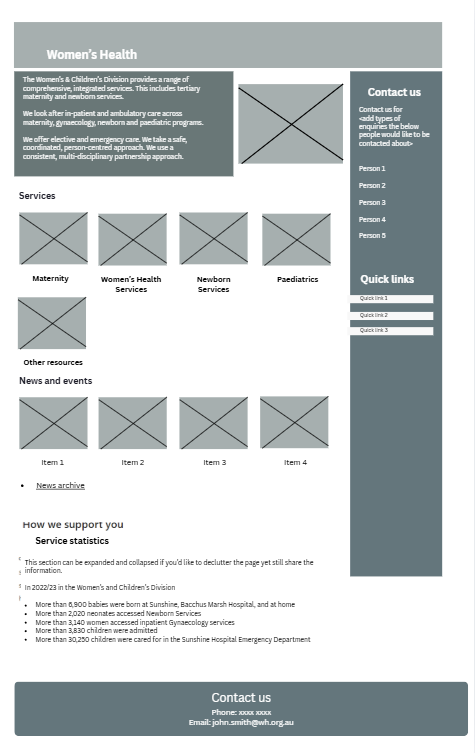
I also know what type of page element to use when setting up the page because I have the content to work from. Examples of page elements are text, image, table, headings.
For instance, if you have an event schedule that would be easy to read in a table format, you’d plan for it in the design rather than using loads of paragraphs or an image.
That way when you’re setting up the page, you’ll know what goes where and what type of element you need to add to the page.
See the below example of how I set up a content design including a section for a table:
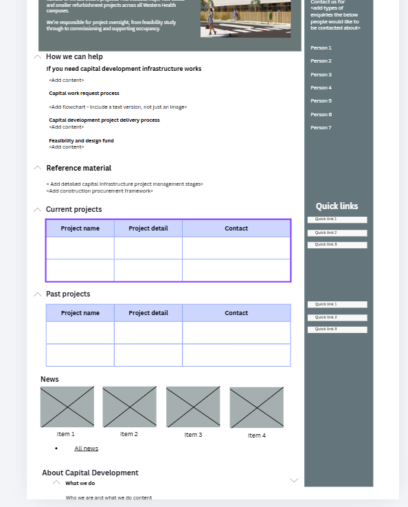
The design serves content that’s been carefully chosen, instead of content trying to mould to a design that was decided too early.
Almost there… preview then publish
Content that looks fine in the editor sometimes looks different once it’s live.
Text spacing goes wonky.
Images don’t show up.
A para you thought was small looks like the never ending story.
I know it’s exciting to get the page out into the world.
But always check the page on desktop and on mobile before you hit Publish.
In a nutshell: content first
Your reader is busy, like the woman I met.
They've got limited time, they're stressed… they need an answer asap.
A gorgeous page with disorganised or outdated content won't help them. They'll click away. And they won't come back.
Use the 5-step process to separate writing from designing so your readers get what they need easily and quickly.
Sort your content first.
Organise it.
Cut the duplicates.
Write for how people actually read.
Then design.
You’ve got this.
Hey mate, what’s the part of building a page that trips you up most: the sorting,
the writing, or the publishing? Drop a comment, I’d love to hear from you.